Outlook Web Access – Outlook Anywhere Comparison
Outlook Web Access – Outlook Anywhere Comparison
PURPOSE
To document the differences between Outlook Web Access, (Current version with Exchange 2003) and Outlook Web App. (New version with Exchange 2010)
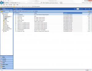
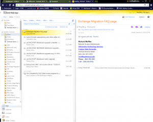
- Below are (2) screenshots; the first is of Outlook Web Access Full Version, and the second is of Outlook Web App (Also called “Outlook Anywhere”) *Note – If you can only log into Outlook Web Access Light Version, you may need to configure your Internet browser for Compatibility Mode. Instructions can be found here.
- The two versions look different, but are essentially the same in functionality. The Outlook Web App (Outlook Anywhere) has more of the appearance and layout of Outlook.
- Several changes have been made from Outlook Web Access to Outlook Web App. They are;
- All folders are listed on the left-hand side of the windows, with no button labeled “Folders” to click on to see the additional folders.
- The only folders hidden are sub-folders, and those are collapsed and can be expanded if needed.
- The use of words instead of icons for the menus at the top of the screen.
Composing an Email
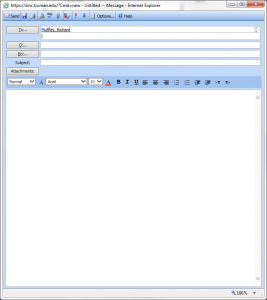
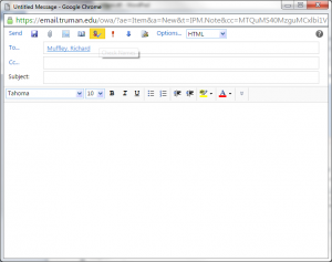
- When composing a new email, the screen may look differently. Below are screenshots of each:
Outlook Web Access – Old version with Exchange 2003
Outlook Web App – New version with Exchange 2010

